I had the fortune to take an eye-opening, three-workshop seminar with Betty Merken. We started by meticulously mixing gouache color swatches to learn about and experience the difference between two color wheels: the traditional Painter’s Color Wheel versus the Printer’s Color Wheel with magenta and cyan replacing red and blue.

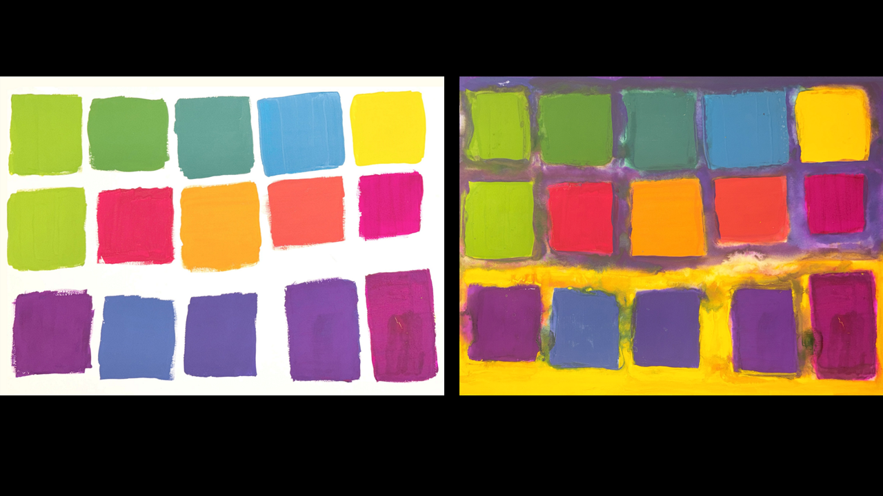
After the color wheels we began experimenting. Below on the left is a study showing the Painter’s Color Wheel swatches with a white background. They vary in how far they advance toward the viewer or recede into the background with the warm yellows and reds appearing to come further forward than the cooler blues and greens. Comparing this to the image on the right, with the same swatches but on a background of yellow and violet, some swatches now pop even more due to contrast in hue, like the yellow and violet swatches on a background of their complementary color. In addition to this contrast in hue there is also a contrast in value, lightness next to darkness, amplifying the yellow and violet as focal points.
Another lesson from this study was how the dark greens and blues in the upper left recede even further on the right image than they do on the white background which appears to make the other color swatches advance even more in comparison. For example, the red and orange swatches advance more on the right image than the left which could be the result of the greens and blues above them receding into the violet background so in comparison they appear further forward.
The red and orange swatches advancing further on the right image also suggests that even though their violet background is not their complementary color it is somewhat distant on the color wheel so there is a partial contrast in hue. One could conclude from this that there is a gradation of contrast in hue based on each swatches’ relative distance on the color wheel from its background.
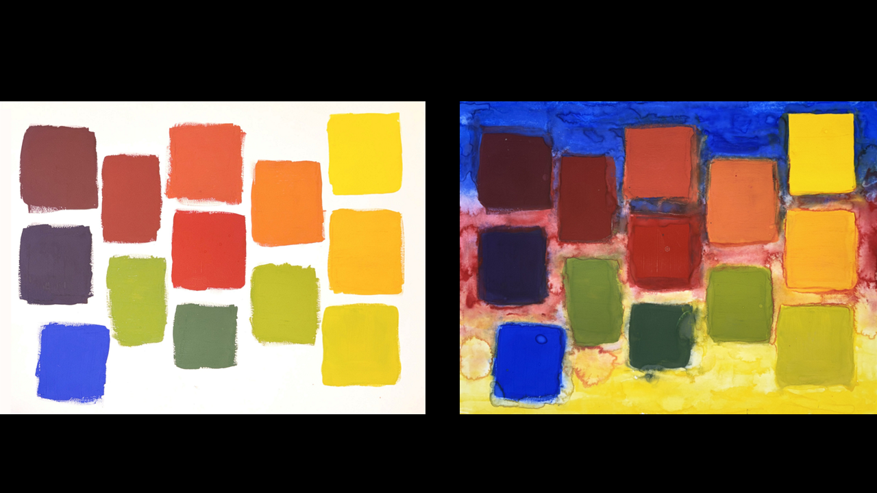
Similarly the Printer’s Color Wheel swatches, shown in the study below, also change how far they advance when perceived against a white versus colored background. In this study the background colors are the three primaries. Several observations: the red swatch appears to advance on the white background yet recede into the light red background due to a lack of color contrast; the yellow and blue swatches, on the other hand, advance more on the right because they are on a background of another primary color; the other corners of light green and dark violet recede on the colored background likely because they are close on the color wheel to their background hue and have a similar value with dark on dark in the upper left and light on light in the lower right.
When seen as a collection of swatches, the colors on the left image advance about the same amount creating a relatively flat plane of swatches. Whereas on the right image the plane of swatches bends forward at the upper right and lower left, due to increased color contrast, and the red at the center sinks further into the background of its own color creating a more dynamic collective surface of swatches.
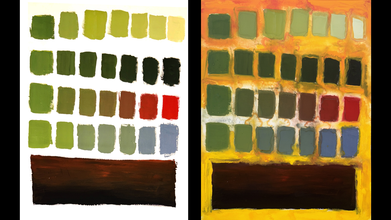
This study below starts on the left with the Painter’s Color Wheel of green, a secondary color mixing yellow and blue to find the mid-range hue between them. In a gradation of value, the upper horizontal band increases in tint toward white while the second band increases in shade toward black. Skipping over the third band for now, we see the fourth band is a gradation at the same value (even level of lightness) toward a gray made by mixing white and black to match the same mid-range value of the full row.
Going back to the skipped third row, the gradation is from the original green to its complimentary red hue on the opposite side of the color wheel. Again, the goal is to try to keep the same value as best we could. The red appears to become a focal point likely because it’s in a field of tinted swatches of its complimentary green color.
Inspired by Rothko, the painting is grounded with a large base. As an experiment I made the base a darker shade of the red focal point above which appears to make it feel less foreign and more integrated.
The background on the right is a gradation from orange (a complement to the green swatches at the top) to yellow (a light value against the dark base). The push and pull of these contrasts in both complimentary hues and dark-light values appears to create a more dynamic experience than on the white background.
The study below starts on the left with a vertical column of swatches that are the same gradation of green to red from the third row in the study above. As the swatches move to the right they are tinted with white, trying to keep a similar value (lightness) up and down each vertical column.
On the right image the background is a graduation from a lightly saturated yellow to a deeply saturated orange using similar hues to the study above but varying their saturation. What I found surprising is that the swatches on the bottom, with complementary hue of green and orange, were less of a visual pop than the top left swatch which was not a complimentary hue but did have the greatest contrast in saturation and value. In other words, the contrast of complimentary hues appears less impactful than the contrast in saturation and value. One explanation could be that red inherently advances more than green, as seen on the white background to the left and the first study above. Therefore, the inherent nature of the color red advancing, amplified with a background that varies in saturation and value has more of a visual impact that then the complimentary color contrast of the green on orange.

Betty Merken’s guidance, starting with simple color wheels and then progressing with experimentation, helped me not only understand the color spectrum and its endless opportunities, but also experience them.